Button Style in Tailwind CSS
Button styling in Tailwind CSS offers a streamlined approach to designing attractive and responsive buttons for web applications. Leveraging Tailwind's utility-first methodology, developers can create versatile button styles with ease, enhancing both functionality and aesthetics.
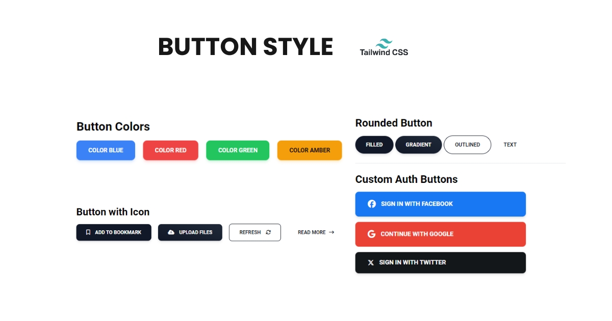
Tailwind provides a rich set of utility classes for customizing button appearance, including options for size, color, border, and hover effects. Developers can quickly adjust button dimensions using responsive classes, ensuring consistent styling across various screen sizes and devices.
Furthermore, Tailwind's color palette allows for seamless integration of button colors with the overall design scheme of the application. Whether it's primary action buttons or secondary CTA buttons, Tailwind offers the flexibility to define custom colors or utilize predefined options for cohesive branding.
Border and shadow utilities in Tailwind enable designers to add depth and visual interest to buttons, enhancing their overall appeal. Additionally, hover and focus states can be easily customized to provide interactive feedback, improving user engagement and accessibility.
Moreover, Tailwind's transition utilities facilitate the implementation of smooth animations, adding polish to button interactions without the need for additional CSS code.
In summary, Button styling in Tailwind CSS empowers developers to create stylish and functional buttons efficiently, thanks to its extensive set of utility classes and flexible customization options. Whether it's a simple call-to-action or a complex navigation element, Tailwind makes it effortless to design buttons that elevate the user experience of web applications.